Welcome to Sample.
Sample is a pattern library designed for Bela.
The purpose of a pattern library is to provide a cohesive description of the design elements (colours, font choices, appearance, etc) for an application or brand. Sample is the pattern library for the Bela, and describes the components used in the browser-based IDE and web properties as well as the elements of Bela's general brand presence.
A pattern library is never finished, and Sample is intended to continuously evolve. As we add features or formalise their use, they will be added to this document.
In the forkable version of this reference the CSS is exhaustively componentised for the sake of clarity and reproducability. This library does most of its work with CSS, but does include jQuery (all JS functionality is contained in the global.js file, which is designed to be lightweight and is currently about 50 lines). Please fork this repo and have a poke around.
Current limitations:
- These patterns are optimised for Chrome, because our IDE is designed for Chrome.
- These patterns do not yet include functionality for mobile devices. This is because this library has evolved in response to Bela's browser-based needs, and apart from our responsive sites we don't do much with devices. This page should be viewed in a browser as it's not optimised at all for devices.
For suggestions, please open a Github issue.
Sample 0.5, September 2019, by Astrid Bin
Text
Fonts
Headings use the font Space Mono
Body text (in print and on screens) uses the font Darker Grotesque.
This is the usual font weight. It can also be a bit bolder, a little bolder still, or really bold indeed.
PCB silkscreen uses the font Little Character.
If it's text in a console, it uses a different font entirely: Inconsolata.
Anchor tags
Currently this is the style for links.
Color
Bela's base color scheme
The colour palette is derived from Google's Material palette, though it has been optimised for Bela's unique UI needs.
This pattern library contains variables for the 5 core teal colours (one parent, one main, three accents), and are used with aplha values with steps of 20%.
Opacity |
$teal-base #009587 |
$teal-main #00bea4 |
$teal-01 #1ce8b5 |
$teal-02 #63ffd9 |
$teal-03 #a6ffea |
100%: |
|||||
80%: |
|||||
60%: |
|||||
40%: |
|||||
20%: |
Bela's accent colors
There are a couple of accent colours that can be used for small visual accents.
Opacity |
$accent-1 #ff5e5b |
$accent-2 #fff07c |
100%: |
||
80%: |
||
60%: |
||
40%: |
||
20%: |
Using grey
There are two ways to use grey: As hex values, or as black with transparency applied. The reason to opt for hex values is when laying out for print, as pantone equivalency is only possible with full-saturation colours and trying to convert transparency values is tedious and time-consuming. In this section are both: Black + opacity, as well as chosen light and dark grey palettes.
Below is a table showing black with opacity:
Opacity |
Result |
$black (100%) |
|
$grey-dark (60%) |
|
$grey-mid (30%) |
|
$grey-light (10%) |
|
$grey-ultralight (5%) |
This is the Bela Light palette:
Opacity |
$grey-light-00 #fdfdfd |
$grey-light-01 #f5f5f5 |
$grey-light-02 #e4e4e4 |
$grey-light-03 #d5d5d5 |
$grey-light-04 #a8a9a7 |
100%: |
This is the Bela Dark palette:
Opacity |
$grey-dark-00 #b7b7b7 |
$grey-dark-01 #969696 |
$grey-dark-02 #656565 |
$grey-dark-03 #353535 |
$grey-dark-04 #000807 |
100%: |
* Please note: These colour rules are for RGB only and do not extend to print.
A note on text over colours
When making text over a colour lighter, do not make the text grey - always use black (RGB 0,0,0 or #000000) and adjust the alpha value.
For example, the box on the left uses
color: rgba(0,0,0,0.5)
,while the one on the right uses the equivalent hex code for middle grey,
color: #7d7d7d
.There's definitely a difference in readability, particularly with higher resolution screens.
Readable
Less readable
Menus
Accordion Menu
I am some content that shows when the accordion button is pressed.
The content panel is shown and hidden using JS when the menu header is clicked.
I've got some content in here, and a couple of sub menus:
The same JS that shows the main content also shows the sub content!
And here's some more content
Dropdown menu: Files
This element should, traditionally, be an input drop-down. However I have taken the liberty of making it a bit fancy because picking a file name is a significant event that happens on its own as an atomic action, and is not part of a larger set of choices (the way that, for example, changing settings are where you might be adjusting many values as part of the action "changing settings"). Therefore, this is a list of links in a hidden div element, instead of a list of options in a select input element.
Dropdown menu: mini
This dropdown belongs in the Input section above, but it's good to have it here to see the difference between the file dropdown and this option dropdown.
In an option dropdown we can adjust the styling and mess with the shadow DOM a little, but some important functionality has to be maintained (which is why it's not just a file dropdown, like the one above). For example, an option dropdown should allow the user to select a number with the arrow keys or press enter to select, and tab to the next dropdown element. This is useful for situations such as the Settings tab where there's lots of small values to adjust, but isn't vital for choosing a project name, which is why we have taken liberties above but not here.
This dropdown has styles for both active and disabled states.
Inputs
Buttons
Switches
Here's some boolean switches that you can turn on and off:
We can also disable it:
Number selectors
Select a number:
Disabled selector:
Text box inputs
This is a text box:
Now it's disabled:
Sliders
Here are some sliders you can adjust. There is a difference in appearance when a slider is in focus, or not in focus:
We can also disable sliders:
Radio buttons
A radio button is used to indicate a single choice from a range of options.
Data
Tables
Tables are used only to contain tabular data.
| Name of data | Value 1 | Value 2 | Value 3 | Value 4 |
| Thing | 5.67 | 6.98 | 4.25 | 2.64 |
| Other thing | 4.74 | 9.45 | 0.25 | 1.46 |
| Another thing | 5.46 | 1.75 | 1.68 | 4.26 |
| Last thing | 4.89 | 2.68 | 1.69 | 8.28 |
Unordered lists
- Thing one
Things on a new line! - Thing two
- Thing three
Ordered lists
In order for ordered lists to be displayed correctly, the content inside the li tag are wrapped in span elements. You're right, it should be easier and fixed in CSS2, but here we are in CSS3, stylin the web like it's 1999.
- Thing one
- Thing two
- Thing three
Logos
The Bela brand uses logos across all platforms and products. This section provides samples, as well as links to download high-res versions of these logos.
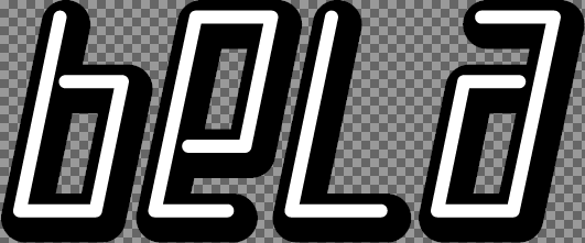
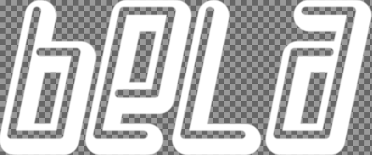
Bela Logo
The Bela logo is only for use on products that are designed or licensed by Bela. This is to avoid confusion, and so you can be sure that anything with the Bela logo is supported by us. (If you would like to use a Bela logo on your project, we have a version just for that! Please see the Made With Bela logo section for guidelines.)
The Bela logo appears in monochrome and with palette colours. Usually the logo uses $teal-01 but $teal-main can also be used.
Use the rightmost version for black backgrounds.
The Bela usually has an accompanying text component. This text can be aligned right:
This text can also be centred:
Made with Bela
The Bela logos above are reserved for use exclusively on Bela designed or licensed products. If you'd like to use a Bela logo for making a sticker or engraving on your own project, we've got a logo version just for that:
TRILL
In 2019 Bela is launching TRILL, a new family of high-resolution touch sensors.
There are two versions. One has no tagline:
The other includes the tagline for TRILL:
SALT and PEPPER
SALT (with its companion SALT+) is a programmable synth module that debuted in 2018. In 2019 we released PEPPER, a PCB for building your own synth module for prototyping. Those logos are here: